Transsion
- Oct 3, 2021
- 5 min read
Updated: Oct 5, 2021
Title: Interaction Design Intern
Time:2021/5/13 - 2021/7/3
Tools:Sketch, Keynote, Origami
In summer 2021, I joined the User Experience Team in Transsion. I took part in the interaction design of the AR Card App from Beta to launch. Besides carrying out this project, I also got the opportunity to improve interaction design for the smart watch product named Oraimo, and to do pre-research about the foldable-screen smart phone specifically for the interactive analysis.
Following is the authorized work to show.
AR Card 🎭
What I did🎈
I took charge of the interaction design for AR Card application from Beta to Launch. I cooperated with PMs, software engineers and test engineers to push the project forward.
According to the feedback from software engineers and test engineers, continuing modifing and iterating the design and cooperate with the UI designer to hand in the high fidelity design.
Because previous interaction designer had to deal with multiple projects when doing this project, there were some flaw about the team communication and the overall consistency of the design and development. Based on my thoughts and feedbacks from usability testing with the Beta product, I improved the overall design by considering interaction, UI and animation comprehensively.

Beta - UI design
Challenges🎢
1. I need to quickly get familiar with team memebers and the process of development.
2. I took charge of this project from the midway, so I have limited knowledge about the background and design rational for this product.
Usability testing📑
By using the developed APK for Beta version, I conducted the usability test within the design team focuing on the process of creating an AR Card (inputing personal information). I validated the design by analyzing the completion and error rate of the operation. According to the feedback, I improved the design by considering the interaction, UI and animation comprehensively.
Beta - 信息录入流程
Identified issue No.1💣
Steps bar made user confused
The original idea was to create convenience for users to navigate among pages by clicking the steps bar. However, according to the test result, users felt confused when seeing all these icons on the page. They even did not realize that it is a Steps bar with its shifting location.
Design improvement No.1🔑
Steps bar design
For the first four pages, the function of which is to allow users to input necessary information, keep the Steps bar stick to the top of the page, in order to create a consistent cognition.
For the last two pages, stick the Steps bar to the top of the white block. It makes users easy to click when they preview the card and need to modify specific information. Animation is also designed to keep the transaction consistent.
Unify the color of the Steps bar.

Identified issue No.2💣
The difference and information layers for icons were not clear
There were many icons in the page and the colorful design made users hard to distinguish the meaning of them. In addtion, icons occupied too much space on the page.
Design improvement No.2🔑
Design and layout for icons
Adjusting and optimizing the size of icons
Balance the visual center of the page

Identified issue No.3 💣
Easy to cause error operation when selecting social information
When selecting which three social messages to display in the business card, the first half of the original design page is a preview business card, and only the lower half of the space allows users to slide and select. The operation space is small, which is very easy to cause wrong operation.
Design improvement No.3🔑
Improvement for selection
Design interactive dynamic effect and provide the function of hidden card preview. By sliding up, the user can expand the information list to the whole page, which is convenient for users to view and select.

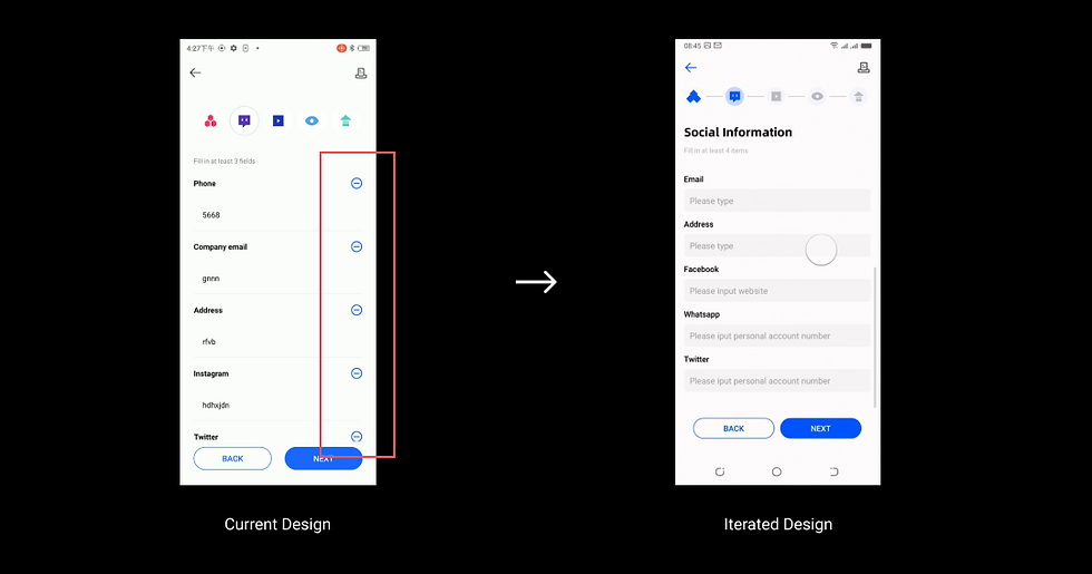
Identified issue No.4 💣
Unnecessary expansion and contraction increases the steps for input information
When filling in social information, users needed to click to expand the imput box. It caused extra operation which had the negative effect for this experience.
Design improvement No.4🔑
Design for the input box
Using scroling instead of clicking to expand and contract because users prefer scrolling than clicking.
For the problems found in the test, the design is optimized one by one. While optimizing the interactive documents, the Sketch file of the UI is optimized, and Origami is used to make an animation demo to visually display the necessary interactive logic and effects.

Interaction document - after iteration
UI improvement + dynamic demo

Origami animation costruction page
Oraimo smart watch⌚
What I did🎈
For the Oraimo smart watch designed by the third-party design team, I checked and evaluated the interactive design, and put forward the design problems and corresponding improvement schemes.

UI interface
Challenges🎢
1. No relevant design experience when using smart watch products for the first time.
2. The target users cannot be found for testing. The main sales areas of the products are Southeast Asia and Africa.
Opportunities👓
When using such products for the first time, the first use experience can well reflect the problems, and it is not easy to be influenced and judged by the design logic of other products.

Real product
How I did ✨
Step 1: Pay attention to the first use experience of the product, check all functions of the product in detail, and record all experience problems. Compare competing products (physical product experience, network evaluation) for comprehensive analysis.
Step 2 : Without access to real target customers, I invited several colleagues who had never used smart watch products to participate in the usability test of the product to simulate the use of real users as much as possible.
Because the target users are mainly users in Southeast Asia and Africa, most of the target users use smart wearable products for the first time and are unable to contact real users for experience testing.
The test scope covered the main functions of the product (motion recording, viewing messages) and main interactive operations (sliding switching up, down, left and right, returning to the main interface from the specific application).
Step 3 : Consult the database of user research reports to understand the background, habits and characteristics of target users, and put forward the design optimization scheme in combination with the the middle and low end positioning of the product.
Users in Southeast Asia and Africa have not experienced the PC era, and many users' first smart device is a mobile phone. For many designs we are used to (the layout of information and the meaning of icon), there is a lack of existing cognition.
With low education level and weak logical thinking and spatial memory, it may be difficult to use products with high requirements for spatial memory such as smart watches.
The target user lacks the habit of using novel interaction methods (sliding left and right up and down and long pressing), and needs ability to accept and time to get familiar.
What I learnt🎉
Goal oriented teamwork; Efficient communication and cooperation skills.
This is the first time I have participated in a complete team cooperation, including product manager, UI designer, software development and test engineer. It is also my first time to participate in the process of actual product development, which makes me better understand the positioning of design in the team and how an actual product is produced.
Under limited resources, maximize the use of available resources, so that every design has a basis
As the main businesses are distributed in Africa and Southeast Asia, it is very difficult to conduct field user research and user testing. Therefore, a more flexible way is needed to obtain product experience feedback. In the process of designing products, I learned to make more use of internal employees of the company to conduct usability testing and understand the use of products. And try to combine the existing research reports and integrate the user characteristics of the target market to design the product.
Comments